A character sheet is a resource commonly found in tabletop roleplaying games. It serves many purposes, from state tracking 1 to space for note-taking, and is a focal point of player agency – a player’s sense of ownership and control over the game world. Any important player-facing information 2 that needs to be referenced during a game session typically appears on a character sheet. They can vary in size and scope from a few words on an index card to multi-page documents of crushing complexity. Although some games omit character sheets entirely, they remain an iconic bit of ephemera across the hobby.
As tangible links between the social and diagetic worlds, characters sheets are often central to the roleplaying experience. For something so important, it is surprising how little thought sometimes goes into their design.
For my game Night Witches, I didn’t want to fall into this trap. The game presents so many barriers by premise and content alone that I knew I wanted everything the players touched to be as engaging and usable as possible. As the primary and very literal point of contact between player and character, I knew that the character sheets needed to function efficiently while serving as objects of inspiration that communicated theme and hinted at possibilities for exciting play.
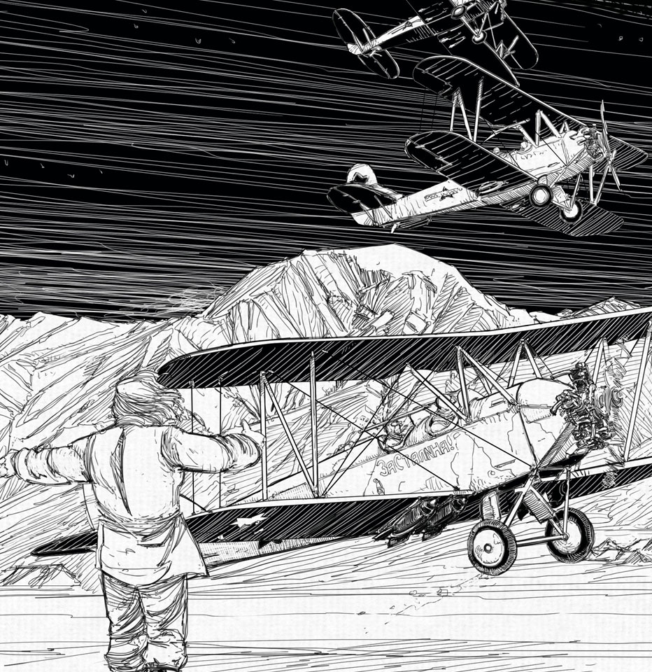
Night Witches (forthcoming in 2015) 3 is a tabletop roleplaying game about the 588th Night Bomber Regiment 4 a group of Soviet airwomen who flew dangerous missions against incredible odds during the Second World War. Struck by their powerful story, I started toying with a game about them in 2007, but only really began serious work after playing Vincent Baker’s brilliant game Apocalypse World (2010), which would be the inspiration for the underlying structure for my take on the Night Witches story many years later. The elegant and always consequential feedback loop between fiction and mechanics in Apocalypse World was a natural fit for the kind of play I had always imagined for my game.
Because there is a lot of information to track in Night Witches, I knew I would need to include a character sheet. Since it occupies the middle ground of complexity, as does Apocalypse World, I found the Apocalypse World model a useful one to follow. You need reference material to play the game, but the essential components generally fit on one side of a sheet of letter-sized paper. This includes your character’s name and background, their “look”, and the mechanical bits that make them special in the game world – moves they can make, things they possess and people they know.
While deciding how to organize the information players would need to reference to play Night Witches, I found that it generally fell into three categories. The first is static information – your character’s name, for example. This rarely if ever changes. The second is stable information – your moves, for example. This changes once per session or less. And the third is volatile information, which changes frequently. A character’s health – Harm, in Night Witches parlance – falls into this category. During a session you may be changing and erasing this many times. These categories of use don’t map one-to-one with the frequency with which they are visually referenced, but they are reasonably close.
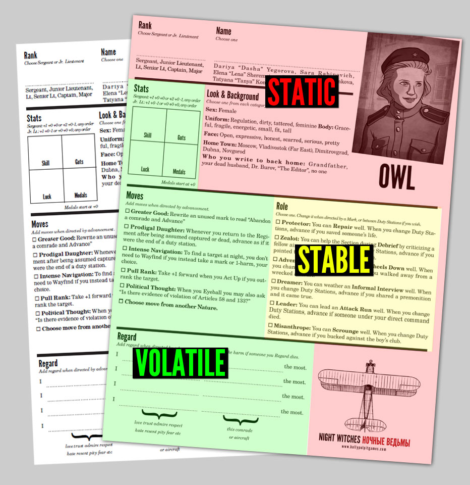
In the static information category, Night Witches has your character’s name and rank, her look and background, and some localizing aids – regimental honors and information on the Regiment’s command staff and your airwoman’s place in it. In the stable information category, your character has a role, stats, moves, possibly some medals, and advancement options that all change infrequently. And finally, in volatile information, you have regard, harm, and marks, all game-specific subsystems that are referenced constantly in play. Stats and moves, while not volatile, are also subsystems that see continual reference at the table. These categorizations were obvious in some cases and less so in others. Over time they became clearer, and their placement was adjusted to reflect their use and utility.
My challenge was to present all this information in a way that was clear, easy to reference, and usable. One of my primary goals was to minimize both handling time and clutter at the table. Character sheets are physical objects that take up space, and a paper-heavy game like Night Witches can be a little overwhelming. In addition to character sheets there are duty station handouts and other necessary play materials, and I wanted to avoid a blizzard of paper on the table.
To this end, early character sheet designs involved presenting the material in booklets. I tried both portrait (4.25” by 11”) and landscape (5.5” by 8.5”) formats, each consisting of two double-sided pages, folded. While these designs neatly reduced table clutter, they increased handling time dramatically. There was no good way to put the volatile information where it would be easy to modify without also relegating often-referenced material to awkward locations within the booklets. I concluded, after a lot of painful experimentation and subsequent observation, that the density of information in this game made booklets a poor fit, and resigned myself to using a standard, double-sided sheet of paper. I was really in love with the portrait-oriented booklet, which I still think holds a lot of potential, but for Night Witches it was a poor fit and I reverted to a more common format.5 Therefore, the final design for the Night Witches character sheets is double sided, letter-sized, in portrait orientation.
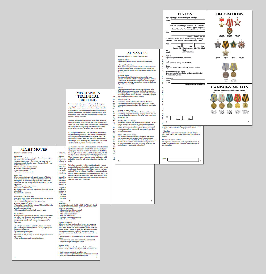
Having settled on the overall format of the character sheets in terms of usability, I then focused on aesthetic design. I wanted a clean, functional layout that echoed the game’s book design, which is strongly influenced by mid-century Soviet texts. When designing the book, layout designer Brennen Reece and I collected visual references centered on the technical manual for the PO-2 airplane actually flown by the Regiment. As a result, both game book and character sheet feature functional groups of information broken up by strong lines: thick horizontals and thinner verticals where they add utility. The information is dense but allowed to breathe6 through the careful use of balanced white space.
One clear design goal was the incorporation of medals. Historically, earning medals was a big deal in the Red Army Air Force, so it is incorporated into the game as both a mechanical and fictive component of Night Witches. Besides, they look cool, and displaying the visually striking medals makes the character sheet more colorful and interesting – which, in turn, makes the sheet more usable 7. The prominent display of medals serves to orient the player to the time and place of the game, an important added benefit in a game that is rooted in real history. Medals began on the front/bottom of the character sheet and, over successive iterations, slowly migrated to the back/top. As stable but not volatile information, they didn’t need to be in constant view. Their presence on the sheet at all was enough to add visual interest and communicate theme.
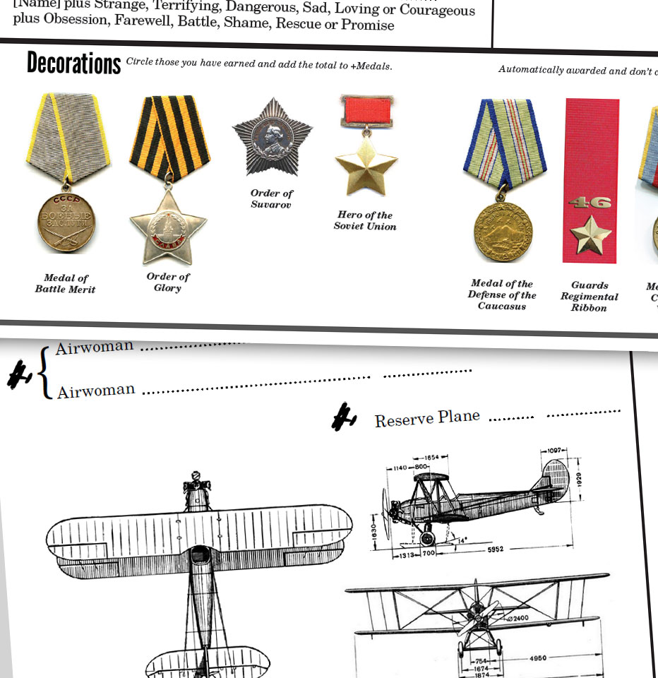
After I observed players sketching their airplanes or modifying airplane images on combat section information handouts, I also added a small but detailed overhead of the trusty PO-2 biplane to the front of the character sheet, and a silhouette to the back. Like the medals, this adds a bit of visual interest and perhaps gently focuses players on the game’s core – women, in airplanes, being heroes. These illustrations take up valuable space but I think the tradeoff is worth it.
The upper right corner of the character sheet is blank – space left free to staple on a passport-sized photo of an airwoman. I knew that relating to these women that the game is about would be very important for the players, and decided early on that we’d commission an artist (the talented Claudia Cangini, as it turned out) to illustrate a score of them. There is a well established tradition of drawing a portrait of your character, as reflected in some of the earliest Dungeons and Dragons character sheets. My character sheets for Night Witches recognize the value in this tradition, making it very easy for players to adopt an image they can relate to – an image they choose themselves or, if they prefer, draw themselves. As an added bonus, the affixed head shot gives the character sheet a more official, bureaucratic look very much in keeping with the time and place.
After making my initial design choices, I then had to test their actual usability. Jakob Nielsen recommends quick and dirty usability testing with a cohort of 3-5 users repetitively8, which sounds like a gaming group to me. With this in mind I put my friends through the character sheet design wringer across the development process of Night Witches as we played through a complete campaign. Almost every weekly session saw them transferring information to a new sheet. I’m grateful for their patience.
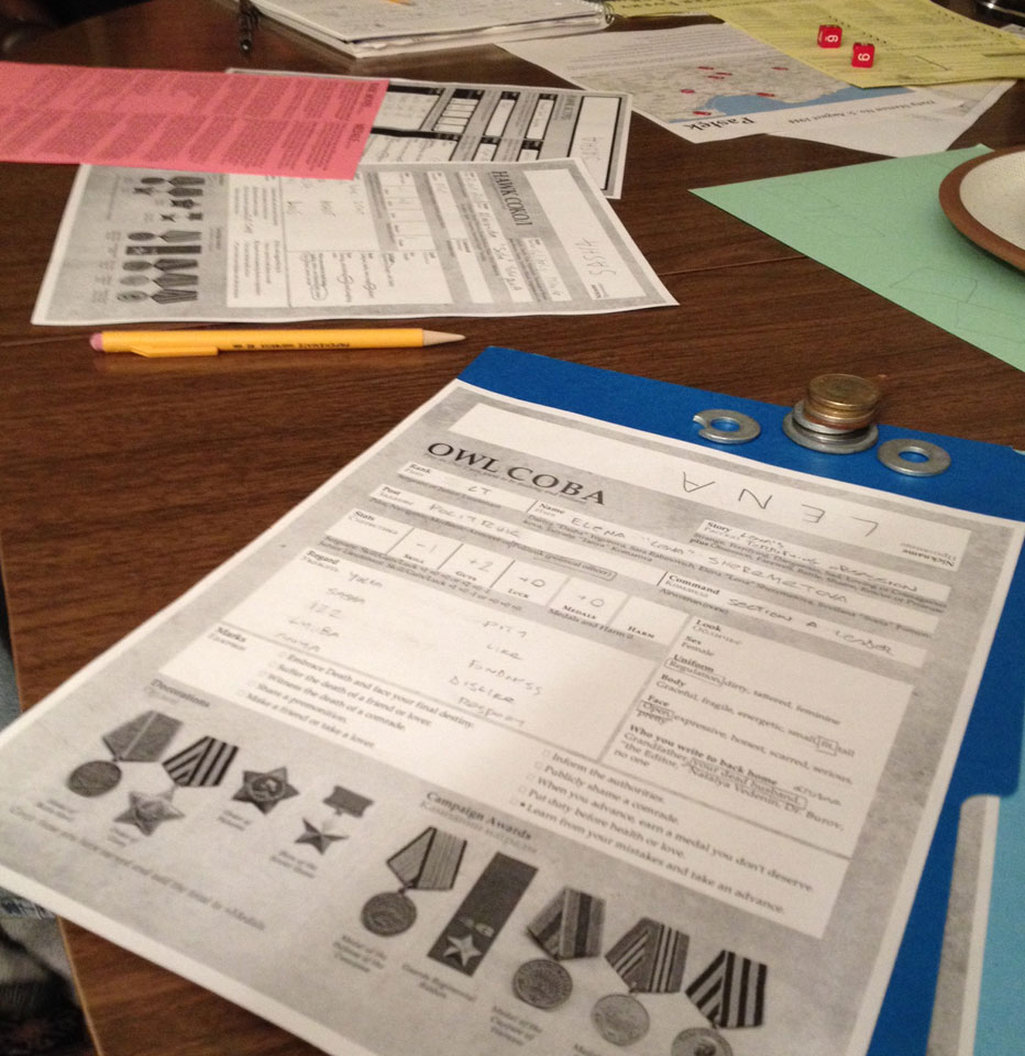
By observing how the players interacted with the elements of the character sheet, I was given strong pointers that influenced my design decisions. One carry-over from the earliest version of the game was something I called the character’s Story, represented by a simple structure that formed a sentence like “Mariya’s Deadly Vengeance” or “Valya’s Unlikely Love”. I loved this idea, which presented a clear pointer toward a uniquely Russian blend of melancholy and melodrama, as well as incentivizing a style of play that fit the fiction I wanted to generate very well. I mechanically incentivized the use of your Story in various ways, and each one failed. Players didn’t reference their character’s Story, progressively more prominent placement on the character sheet had no effect, and it rarely entered play. In the end, based on my observations, it was removed from the game without any real loss and many of the elements built into Story found their way into moves, GM guidelines, and other areas of the game.
Another example of how observing playtests influenced my design choices is the selection and use of player moves. Inspired by Marshall Miller’s great game The Warren (forthcoming in 2015), for a time, I had all the available character moves listed on every character sheet – a communal resource. By direct, painful observation I learned that this was a nightmare for a game as complex as Night Witches. Tracking who had taken which moves became complex and problematic. I eventually reverted to moves “owned” by individual playbooks, a far more common approach. It is illuminating how often I reverted to old, well-used forms in this process.
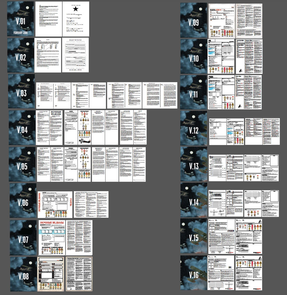
Ultimately, I generated around two dozen versions9 of the Night Witches character sheet, some featuring modest, incremental changes and some showcasing radical departures. By carefully observing how these sheets were used in play, I was able to not only refine the visual design of the functional tool but also re-examine and improve the game itself, which addressed my goal of improving usability. I addressed my second goal of including aesthetics, theme, and inspiration in the character sheets by incorporating period-specific visual design choices, coupled with the careful use of images. What I learned through this very focused process was that the evolution of a character sheet, or any piece of essential player-facing ephemera, can mirror the evolution of a game’s design and serve as a metaphor for design missteps and triumphs. By making a commitment to both usability and the aesthetics of play, I was able to iteratively improve Night Witches outside the realm of traditional playtesting.
–
Featured image created by Rich Longmore, and used with permission of the author.
–
Jason Morningstar, MA, MSIS, is a game designer and information technology professional who lives in Durham, North Carolina, USA. In addition to Bully Pulpit Games, the imprint he co-owns with partner Steve Segedy, Jason works at the UNC School of Nursing.
Best known for his game Fiasco, which earned him his second Diana Jones Award for Gaming Excellence, Jason’s game design credits include The Shab Al-Hiri Roach, Grey Ranks, Durance, and many other games. His most recent roleplaying game, Night Witches, will be published in early 2015. Beyond roleplaying, Jason consults on the use of games for teaching and learning in medical education, most recently with the University of North Carolina at Chapel Hill, Kaiser-Permanente Health Care and the Innovation Learning Network. In addition to design, Jason has written extensively on game-related topics. His article “Beyond the Game Master”, co-written with Emily Care Boss and Ivan Vaghi, appeared in States of Play: Nordic Larp Around the World. His essay on improvisation, “Agreement, Endowment, and Knowing When to Shut Up” was recently featured in the anthology Unframed: The Art of Improvisation for Game Masters.

Very well written. Gold. Definitely some truth to be had here that I’ve also noticed making my own character sheets.
Excellent insight, thanks, Jason!
Especially with indie games, I see some great games fall short on char sheet design.
This detailed description of the character sheet evolution is an invaluable resource for RPG designers.
Invaluable article. You captured the design process and emphasized to me the importance of the way that the character sheet engages the players with the game itself. I appreciate you taking the time to write this especially as I am about to embark on designing a character sheet for an Apocalypse World hack myself. Also, love Night Witches – many thanks, Matthew.